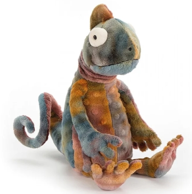
jellycat
Soft Hues and Gentle Joys: A Colour Lover’s Take on Jellycat Australia’s Plush Companions
As someone who pays perhaps too much attention to colour (occupational hazard when you’ve studied it for years), I have to admit that discovering Jellycat Australia was a quiet thrill. Not the kind of loud, ecstatic thrill that comes with, say, landing a rare art piece or finding a limited-edition sneaker in your size—but a subtler, sweeter one. Like the kind of joy that creeps in when you notice how the dusky blue of a bunny’s fur softens the edges of a chaotic day.
Living in Australia, with its scorched summer light and eucalyptus shadows, you start to appreciate softness in all its forms. Jellycat AU somehow gets this. Their plush toys don’t just feel soft—they look soft. And a lot of that comes down to their mastery of colour.
Take Bashful Bunny, arguably the crowd favourite. You’ll see it in Blush, Cream, Silver, and the iconic Dusky Blue. The colours aren’t just pretty—they’re cleverly calibrated. The low saturation gives a dusty, muted tone that makes the toy look both timeless and calming. High-saturation colours would’ve made it feel shouty or overly synthetic. Instead, Jellycat’s palette whispers, and in doing so, it feels personal.
What I find particularly comforting is the way they play with value—lightness and darkness—in a very intentional, controlled way. For example, you’ll notice that most of the plush animals sit in a narrow band of mid-tones and lighter shades. There’s rarely anything truly dark or boldly bright, and that’s part of the charm. These toys are about comfort and safety, after all. High contrast might create visual excitement, but it’s also stimulating in a way that doesn’t quite gel with the emotional function of a comfort toy. It’s like how we favour pastel skies over neon signs when we’re winding down.But that’s not to say Jellycat doesn’t know how to surprise you.
I recently picked up the Amuseables Avocado from their food-themed line—don’t laugh, it’s adorable—and the use of split-toned greens genuinely impressed me. The outer “skin” is a more saturated forest green, a touch deeper than most of their plushes, while the inner “flesh” is this gentle yellow-green, still muted, still soft, but enough to create a bit of contrast. Not sharp, just enough to catch the eye. It plays with complementary contrast in a super subtle way—you almost don’t notice it until you’re looking closely. And that’s the thing: Jellycat colours reward attention.
One of my friends, a new mum, has three different Jellycat animals in her nursery. She tells me the colours were a deciding factor. “They don’t look like typical baby toys,” she said. “They’re not garish or covered in primary colours.” That hit home for me. Most children’s toys are saturated to the point of being overwhelming. It’s almost like they scream “developmental!” in capital letters. But Jellycat feels more like a lullaby than a lesson.
There’s also a level of hue cohesion across the range. Even when the toys depict wildly different characters—a bashful koala, a smiling cactus, a perky peanut—they feel like they belong to the same visual world. It’s in the restrained palette. It’s in the way even the yellows are buttery, not brash; the reds, if they appear, are softened into pinks or corals. This kind of subtle unity matters. It’s what makes a shelf of Jellycat friends look curated instead of cluttered.
And I have to talk about the seasonal editions. Last autumn, I spotted a limited edition bunny in a rich, pumpkin-spice tone—think burnt sienna meets gingerbread. It was warm and cosy and instantly made me want to light a candle and bake something. That tone had a slightly higher saturation than usual, but still within Jellycat’s restrained range. It worked because it tied into seasonal emotional cues: warmth, comfort, nesting. They seem to intuit how colours make us feel, and not just how they look.
Even their neutrals are nuanced. The Cream Bunny isn’t a flat white—it has undertones that lean slightly yellow, which gives it warmth. The Silver Bunny is more like a heather grey with a hint of lilac, which keeps it from feeling cold or sterile. These are the kind of subtle colour decisions that don’t hit you at first glance, but they’re doing emotional labour in the background. It’s like colour therapy disguised as a cuddly animal.
I’ve heard people call Jellycat toys “aesthetic,” and yes, they are. But that word doesn’t quite capture it. For me, they’re more like visual sighs—gentle, thoughtful, and soothing. The kind of thing you want to keep in your living room without it feeling like a crèche.
And in a country like Australia, where the light can be harsh and the colours of nature swing between bold ochres and deep ocean blues, there’s something grounding about bringing a Jellycat home. Their colours don’t try to compete. They offer balance. They soften. They give you, quite literally, something warm and beautiful to hold.
So yes, I’ll probably continue finding excuses to add another one to the collection. Not just because they’re cute, but because they understand that colour is not just seen—it’s felt. And Jellycat? They feel just right.